This post is also available in:

For an artist, attending Streamline Publishing events is like taking a trip to Toyland or the city of Eureka: a magical time-space, dense with appointments during which the notepad or sketchbook becomes the best friend to whom to entrust the advice and information absorbed during the demonstration sessions.
After all, the data speak for themselves: every year the number of registrants increases overwhelmingly.
The credit for this success is due both to the expertise of the faculty members, selected from among the best international artists and so generous in illustrating their knowledge, and to the assistance and friendliness of the Streamline Publishing team, always ready to answer the audience’s countless questions and solve any technical or management issues.
The icing on the cake was put on as always by Kelly Kane, placid co-hosting of the event, and Eric Rhoads with his overwhelming enthusiasm.
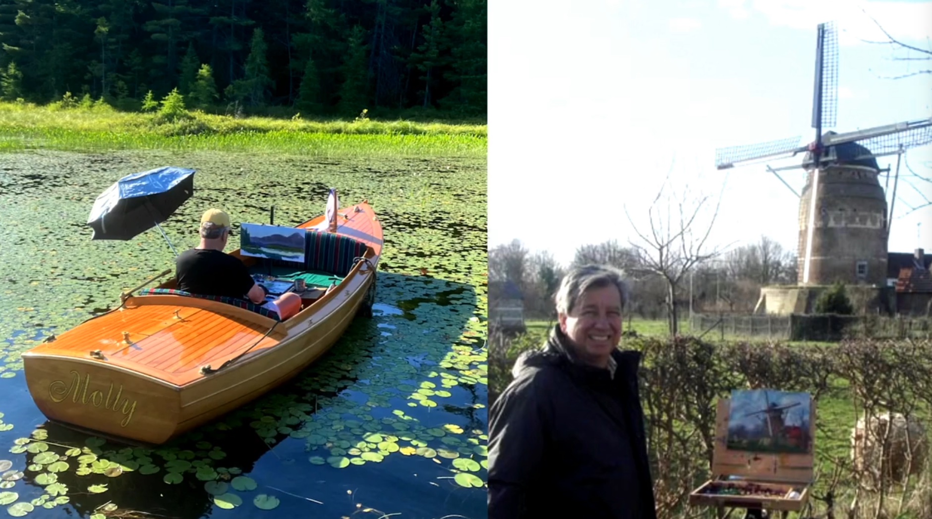
Opening the second day of Watercolor Live, after a comprehensive presentation by Jeff Olson -a well-known face of Royal Talents (among the Platinum Sponsors of the event) and a great connoisseur of the materials- was Yong Hong Zhong: an artist originally from China and raised in America who has worked as an illustrator for Disney.
In the demonstration session, Zhong showed how it is possible to intervene in storytelling from a photographic reference, but develop it in a personal way that is not overly detailed. “Just suggest details, don’t spoonfeed them!” declared the artist. According to Zhong, inserting too many details does not make it easier for the viewer to interact with the painting, which then becomes the common thread capable of uniting artist and audience. For this interaction process to be effective Zhong argued the importance of painting serenely because the artist’s mood is reflected in the final work. “Having fun while painting is a feeling that comes straight to the viewer,” Zhong said.
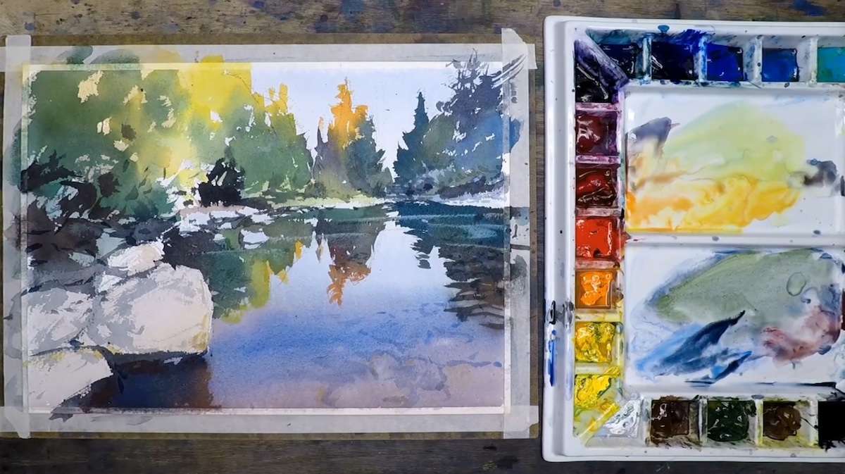
The artist almost exclusively used a Chinese calligraphy brush to create the lake work. Indeed, the study of calligraphy had a very significant impact on his style, characterized by poetic brush strokes that did not go unnoticed by guests. However, according to Zhong, the focal point to focus on is the study of composition, which he achieved with a balanced palette: warm in the foliage and cooler in the reflections of the water that emerges in all its realism conveying the viewer’s attention. Among the advice dispensed by Zhong is the importance of believing more in oneself in the brush that represents the extension of the arm and thought.
The concepts around which Linda Baker’s style is developed in still life composition, in addition to the tonal values distributed equally (light, medium and dark) over the entire composition, are: the masking of the parts of the sheet not affected by the background color and the presence, in equal measure, of small, medium and large shapes. “Industry studies have shown that geometric and architectural lines capture the viewer’s attention more,” said the artist, who also provided interesting tips for tricking the viewer’s eye in the case of inaccuracies.
Part of the beauty of the still life composition created by Baker lies in the blend of primary colors she used to create the background patterns, which were made by starting by spreading the color (previously diluted with water to the consistency of milk) directly from the jar. Then, by spraying plenty of water and exploiting the properties of gravitational force, she directed the movement of the pigment across the sheet until the desired result was achieved. The result is an eye-catching and visually complex composition, yet simple in execution.
Since the artist is in fact a “visual entertainer,” according to Baker the painter must make compositional choices capable of capturing and conveying the viewer’s attention.
There are multiple architects attending the third edition of Watercolor Live. Before the digital age, in fact, architectural renderings were done in watercolor. Among these architects, some have made art their refuge in retirement, while others have voluntarily left the profession to devote themselves entirely to painting.
Ian Steward is one of these, and the presence of architectural points and precise stylistic lines, within the composition, only confirm this.
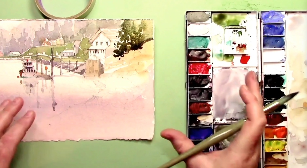
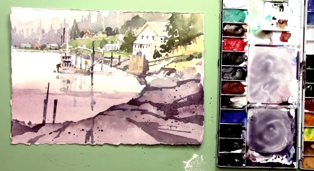
For the Live demonstration session from his studio in Willapa Bay, WA, Steward created a very evocative maritime composition in which he added and modified pre-existing compositional elements, showing the processes and incentivizing the audience to dare, to experiment, because, as he himself stated, “You need to dare and push beyond your limits. This may lead to failure, but surely failure is the best advice you can have to improve.” Reiterating a phrase that has now become a mantra and that says:” less is more,” the artist focused on the analysis of the three cornerstones on which his composition is based: the focal point, the definition of the accessory compositional elements, and the study of water rendering, which cannot disregard certain physical laws and which make the process more complex. Thus making a composition from transparent washes Steward at one point made what he calls a “big move “by which he incorporated the darker shades of foliage.
A watercolorist in the most traditional sense of the term, the artist said he dislikes neither blotting paper, to which, to remove excess color, he prefers a traditional chamois; nor masking, relying solely on the admirable eye-hand coordination he has honed over years and years of practice.
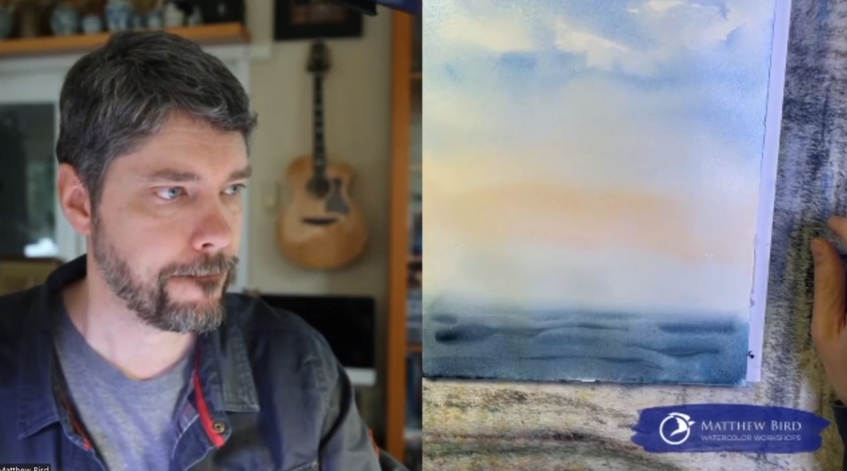
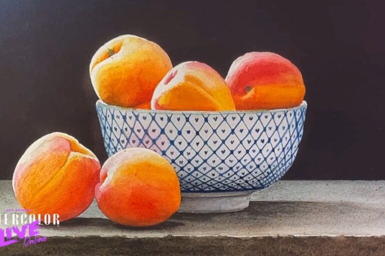
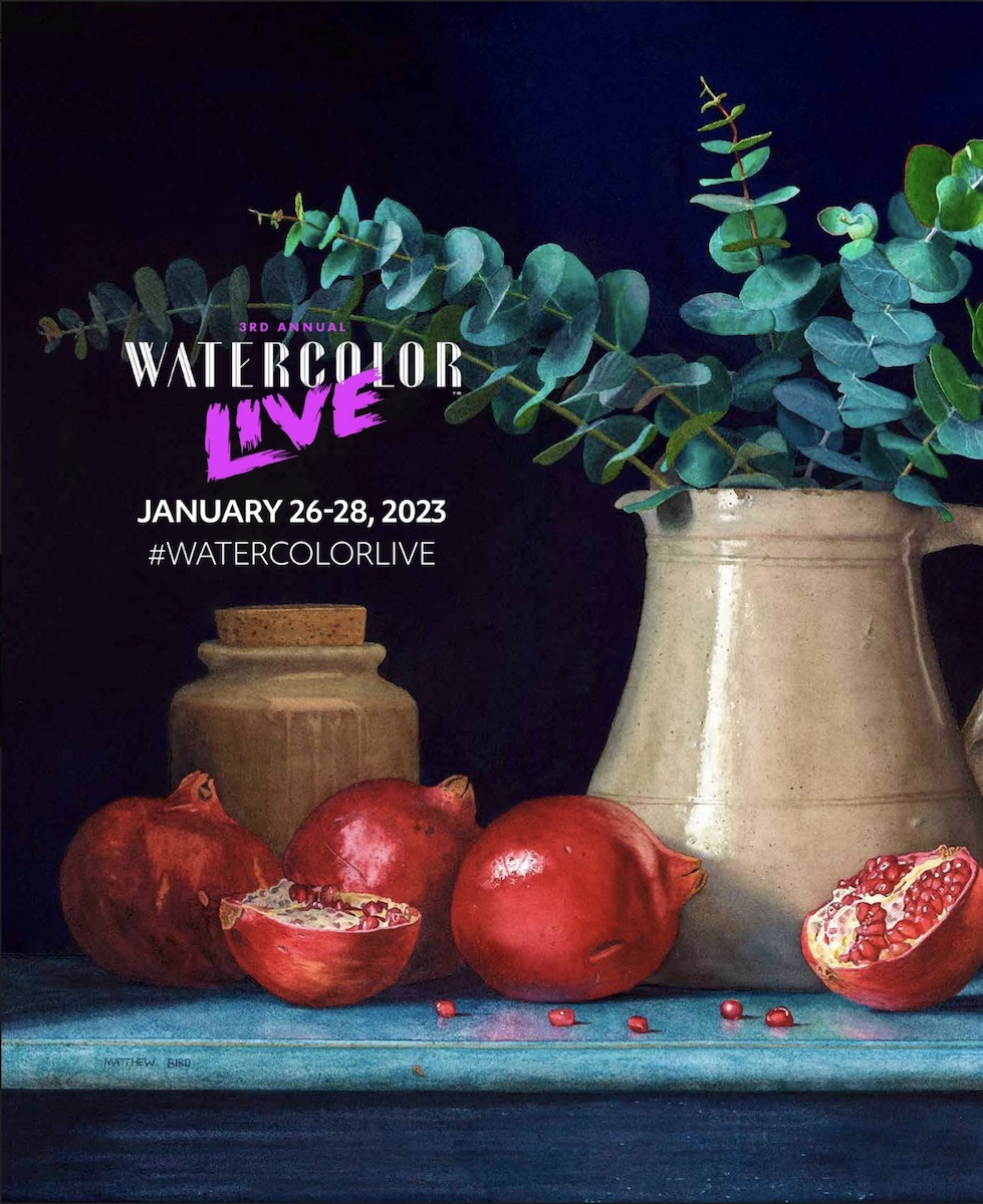
Artist Matthew Bird, who is also the author of the cover of the official poster for Watercolor Live 2023, executed a very realistic still life composition including: a bowl filled with juicy apricots and arranged on a wooden table. The artist admitted that making the background dark, helps him in the subsequent elaboration of the tonal and color values of the composition. Next, with the background dry, he took care of the foreground elements, individually coloring the apricots (which being round behave like a sphere) and the finely and patiently decorated oval bowl. The multi-layered realization of transparent watercolor brushstrokes was very reminiscent of the portrait executed yesterday by Patricia Guzman: after all, the realistic definition of scenes is based, in watercolor, on a multiplicity of layers of transparent watercolor on which texture is built. At the conclusion of the demonstration he finished the details with Brown Van Dyck by increasing the value contrasts.
To study color values Bird suggested an exercise he routinely does, namely arranging the composition under artificial light to see how the elements behave following the laws of light refraction.
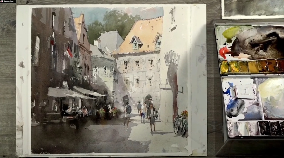
Watching artist Vladislav Yeliesevey at work is like watching an action movie, after all, he himself claims: “The faster you go, the more productively your attention is focused, achieving excellent results.”
Originally from Russia, Vladislav Yeliesevey, currently resides in Sarasota, FL, a place from which he connected for the live demonstration session. It was an exciting session that was able to awaken the audience from the afternoon torpor both by the speed of execution of the painting and the loquacity of interaction with the audience.
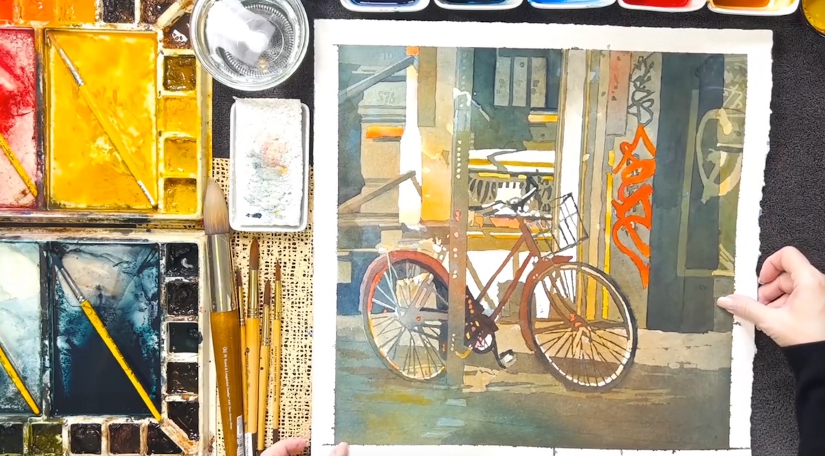
However, beyond the compositional rigor of which he is a master and which he also employed in the creation of a purely French-style cityscape glimpse of the city of Český Krumlov, Czech Republic, what most impressed the audience was his impressive drawing skill, which remains mapped on paper despite the basic underpainting and which he finishes at the end of the composition with calligraphic strokes typical of Asian peoples.
His skill in drawing was forged first by classical art training at the Moscow School of Art, and later in the years of study and practice to obtain a master’s degree in architecture.
In order to develop drawing skills according to Yeliesevey, it is necessary to study and repeat exercises on perspective, principles of composition, and the study of tonal values over and over again.
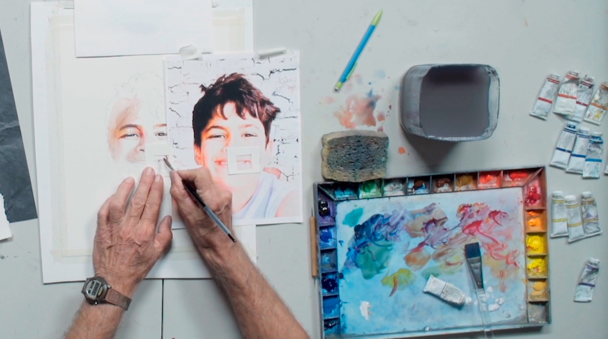
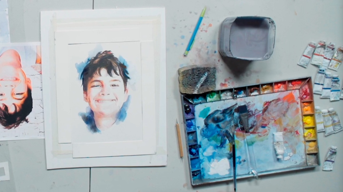
It was Stan Miller who closed the second day of the third edition of Watercolor Live and he did so by making a portrait of his grandson using an innovative method compared to those seen previously. In the previous days, in fact, participants observed different approaches to the art of portraiture, all different from each other and all equally valid. Stan Miller’s was undoubtedly one of the most effective methods, especially for novices.
To create the composition, after summarily transferring the image with copy paper and acetate sheet, he arranged small squares around the area of the face to be painted, selecting the color and tonal value until the composition was concluded in a sculptural and harmonious manner.
Miller’s method runs counter to what has been said so far, because according to Miller, for the realization of a realistic portrait, it is not necessary to interpret the color but rather to look for the color most similar to that perceived by the human eye. “If a portrait is realistic, by definition, it must reflect reality,” said the artist, who on finishing the composition rotated the medium to refresh the eyes and correct any errors.
The day ends as usual with the paint along event and Miami Niche looks forward to seeing you tomorrow to see what other surprises this extraordinary edition of Watercolor Live has in store for us.
(on the title, Matthew Bird’s still-life final work demonstration)
