This post is also available in:

There were many novelties proposed by Streamline Publishing for the third edition of Watercolor Live. Novelties that involved not only the use of a new digital platform, specially designed and put into operation for the occasion, but also the reorganization of the events, which, starting in 2024 will be midweek. Special thanks should be acknowledged, in addition to the event hosts-Eric Rhoads, great entertainer and business man, and Kelly Kane, Editor in Chief of Plein Air Magazine- to the Streamline Publishing team: always helpful and patient in solving technical and informational issues. Additional thanks go to the event sponsors, who are the icing on the cake of an already very enriching event. In fact, the sponsors not only offer demonstration sessions, most often by renowned artists, but also give participants the opportunity to try, at no cost, the the products offered.
But let’s get to the heart of the convention.
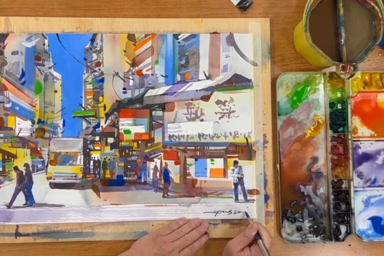
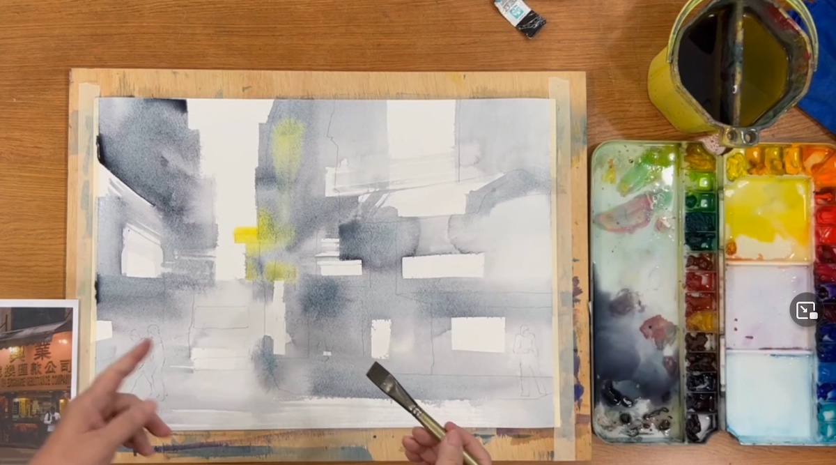
The first guest of the day was Malaysian artist Jansen Chow who, with a depiction of a typical local market, brought all the colors of his homeland to Watercolor Live. The purpose of the demonstration was to imprint in the painting the feelings and lively atmosphere at the local market. Emotions that are difficult to perceive in the reference photographic image alone.
The final work, seemingly simple, is actually the result of a complex and skillful superimposition of individually arranged layers of primary colors, with which, starting with an underpainting made with small brushstrokes of transparent gray, he emphasized color contrasts, orchestrating, mostly freehand, the architecture of the scene.
Chow’s style, as stated by the artist himself, was influenced by ink painting typical of Asian culture. In his choice of colors, harmoniously structured with respect to color temperature and tonal values, he instead used darker tones with which he defined the focal point. In Chow’s palette, the star color was cobalt blue, which, in addition to being his favorite color, is among the dominant colors of his land.
The result of the demonstration was a striking landscape abstraction, full of evocative geometric shapes emphasized both in the translucency of the initial colors and by the use of gouache with which he skillfully rendered the scene’s nighttime atmosphere and points of light.
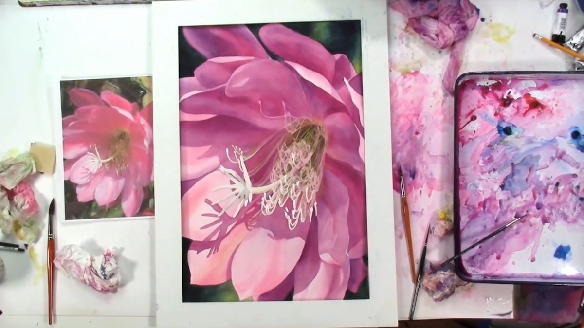
Birgit O’Connor, a renowned floral artist, created a large-scale painting of the Epiphyllum: a beautiful flower characterized by long stigmas. The purpose of O’Connor’s demonstration was to show how the watercolor technique can also be used, contrary to popular belief, in the creation of large-scale compositions.
Not an easy process considering the many technical pitfalls of the medium.
After masking the flower’s long pistils, she made broad washes of color on the petals in wet-on-wet mode. To the definition of the tonal values of the individual petals, she then contrasted the painting of the pistil made with a dramatic change of tonal values, leaving the background composition for last. Only at the end she harmonized the composition, going to lift the excess color of the petals and highlighting the contrast between the edges, in a continuous back and forth.
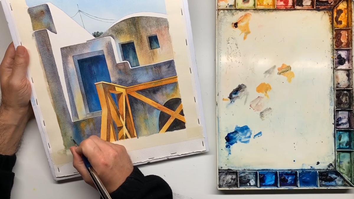
Greek artist George Politis took the Watercolor Live audience among the nooks and crannies of bright Santorini. In the demonstration session he particularly focused the audience’s attention on the interesting color textures that both sunlight and blue sky exert on the characteristic white dwellings, typical of Greece.
In the execution of the composition, he particularly focused on the symbolic meaning attributed to the colors according to which, for example: yellow and ochre are a symbol of light, bloodstone could represent the architectural structure while moonlight can be read as the symbol of shadow. A correlation that can also be a valid method to refer to in the creation of a correct architectural composition, in which, the definition of what one wants to communicate together, with the correct mixing and harmonization of colors, is ultimately what matters. Colors that Politis amalgamates directly on the sheet by working wet-on-wet in a sectional manner and emphasizing the contrasts between the parts to make the compositional complex stand out in the whole.
How many of you think that the whiteness of surfaces is simply “white”?
How does the surrounding environment interfere with the definition of white?
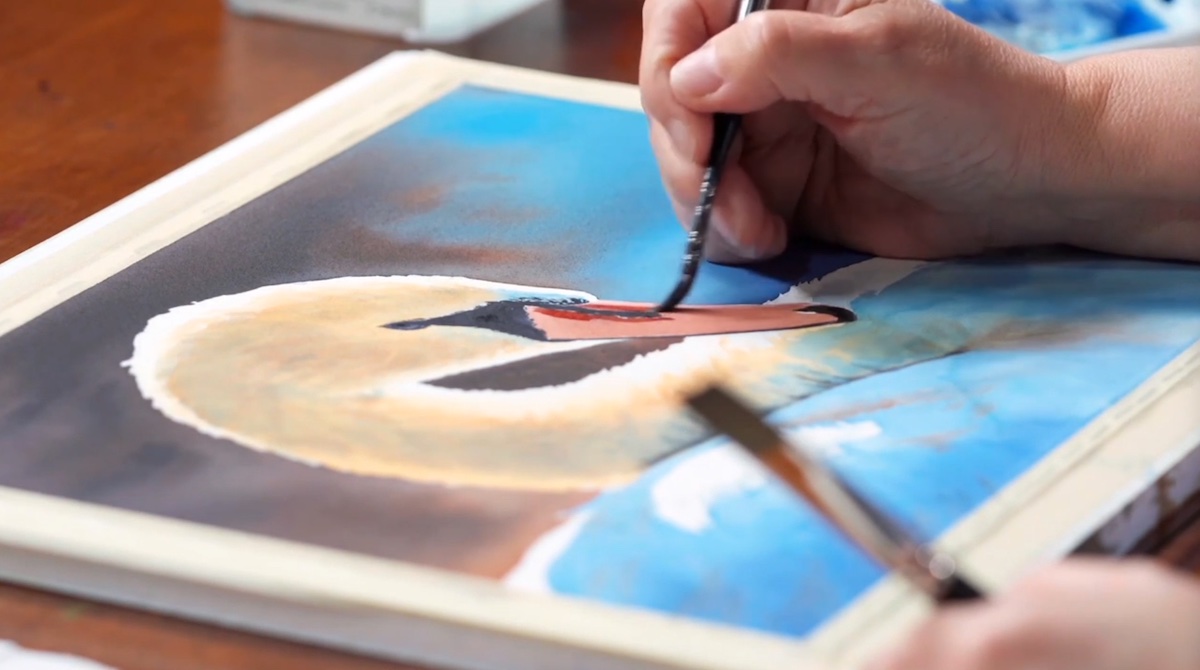
These and many other questions were answered by Canadian artist Shelley Prior, known primarily for her boldness in representing light in particular subjects, such as animal hair and plumage. In fact, for the daily demonstration session, she chose to depict a beautiful specimen of a mute swan, which differs from others because of its distinctive orange beak.
The swan, like the white mountain sheep performed at last year’s Watercolor Live, is one of the most complex animals to represent. It is so both because of the characteristic plumage, “white” and fluffy, and because of the complexity in the truthful rendering of the feathers, which in some anatomical features of the animal undergo an abrupt directional change that must be taken into account.
Starting from the concept of white, which is not always the same but which more than any other color tends to absorb the colors of the elements around it, Prior made the background, with which she helped herself in defining the subsequent tonal values. With color washes she highlighted the swan’s color temperatures, on which she then built the anatomical structure of the feathers, alternating long, single-directional brushstrokes (the outer feathers) with shorter, faster, opposite-direction brushstrokes (below the neck and in the face area), with which she created volume. To the previous layers of color she supplemented, with small tonal transactions, light touches of darker color differentiating the own shadows from the brought shadows that emphasized the volume of the animal, which was uniformed at the end of the composition by the passage of a flat, slightly damp brush that did not reactivate the underlying color and offered further homogeneity to the composition.
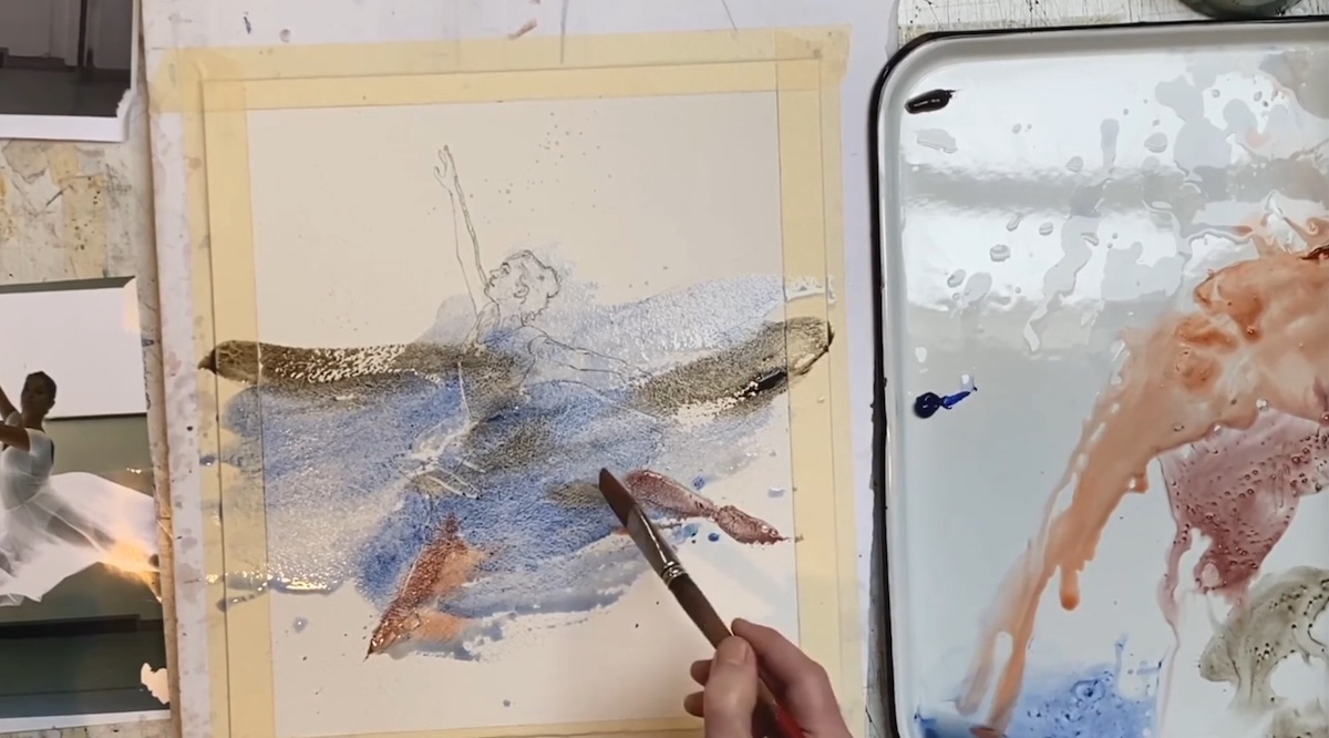
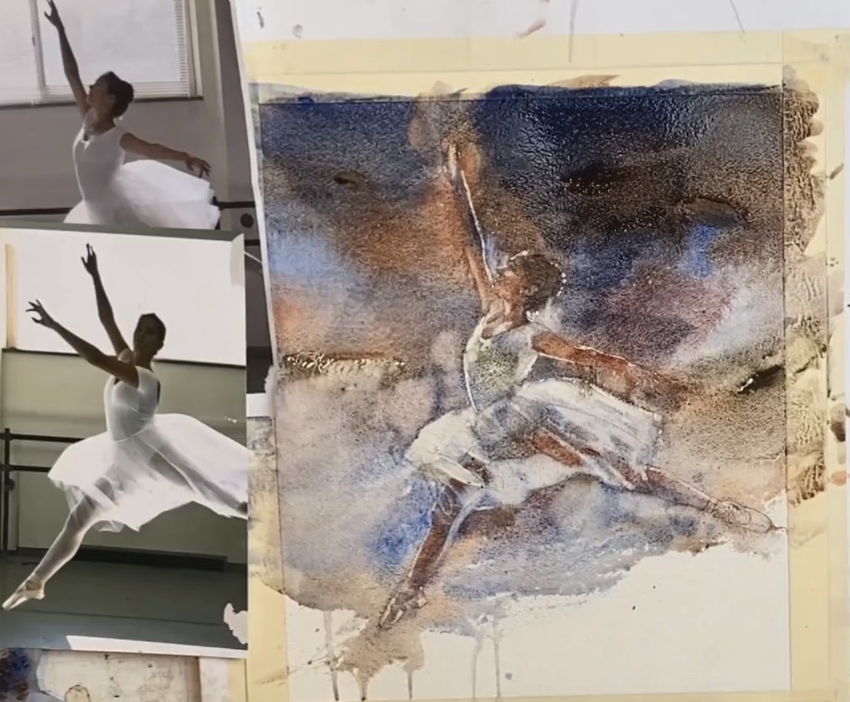
That Ken Call’s composition process had the “wow” effect was common knowledge, but seeing the progressive development of the work was truly revelatory.
Referred to in the milieu as “the painter of movement,” Ken Call chose to depict a dancer engaged in a dance step from two photographic references, helpful in integrating the selected details. To do this he used a limited palette of only three colors chosen based on the tone of the scene. With these three colors he laid down the first brushstrokes-apparently abstract-with which he highlighted the rhythmic flow of the dancer. Again with the first brushstrokes he defined the overall tonal values of the composition, working in a continuous “put and take” of color from whose drying all the volume of the tulle and the sacredness of the dance step emerged.
In the final stages, moreover, the artist devoted himself to the expressiveness of the face and the finishing of the slippers: the element that par excellence represents dance.
Call did an impressive demonstration that Degas would certainly have appreciated also because, as per the artist’s candid admission:” moving figures are my key to show my emotions.”
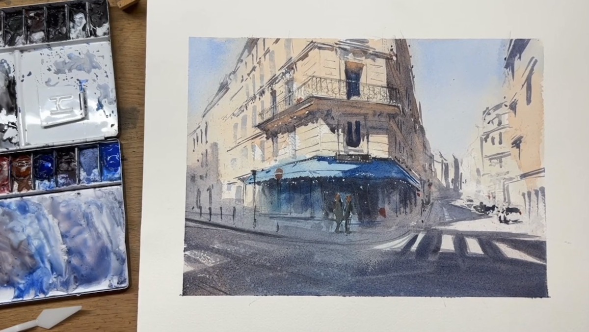
Between the Watercolor Live sessions, the step from Greece to France was a very short one. The last artist of the day was in fact Alex Hillkurtz. Born in England and raised in California, Hillkurtz succumbed to the architectural charms of the Ville Lumière, where he currently resides. For the demonstration session, with a distinctly impressionistic style, he depicted a typical Parisian café. “Paris is such a picturesque city. Looking at its old buildings allows one to savor the history and events that have made it a protagonist over time,” said the artist, who made no secret of his particular fondness for perspective, both linear and atmospheric. Hillkurtz’s compositional result is an almost evanescent scene in which the buildings on the two boulevards serve as a corollary for the focal point centered on the café and depicted in detail. Hillkurtz worked by pointing from a detailed pencil sketch surmounted by a multiplicity of layers of transparent watercolor from which compositional details emerge: real visual suggestions underscored by the expert use of the brush moving as if it were a pencil. Mindful of his experience Hillkurtz invited participants to experiment with architectural composition by searching for their own dimension in some corner of the city.
The third edition of Watercolor Live has come to a close. Streamline Publishing, however, has in store for its large audience many diverse events with which you can approach the medium and genre that suits you best. All you have to do is visit the site and register for the scheduled events, the first of which will be Plein Air Live, online March 9-11, the pre-event training day scheduled for March 8. Register at the following link: https://streamlinepublishing.com/art/or or stay tuned to Miami Niche.
