This post is also available in:


Watercolor Live, the exclusive event dedicated entirely to watercolor, officially opens its doors today. It does so with the expertise and friendliness of Kelly Kane and Tish de le Bretonne, Streamline Publishing’s copywriter and marketing strategist, who has replaced, The Man, Eric Rhoads: the tireless creator of Streamline events currently “under the weather.” The conventions organized by Streamline Publishing are always exciting if only because attendees attend from all over the world highlighting the beauty of cultural difference united by a great passion for the arts.
It is artist Alvaro Castagnet who kicks off the training sessions.
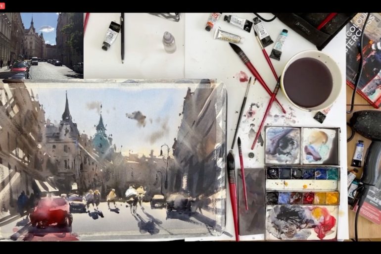
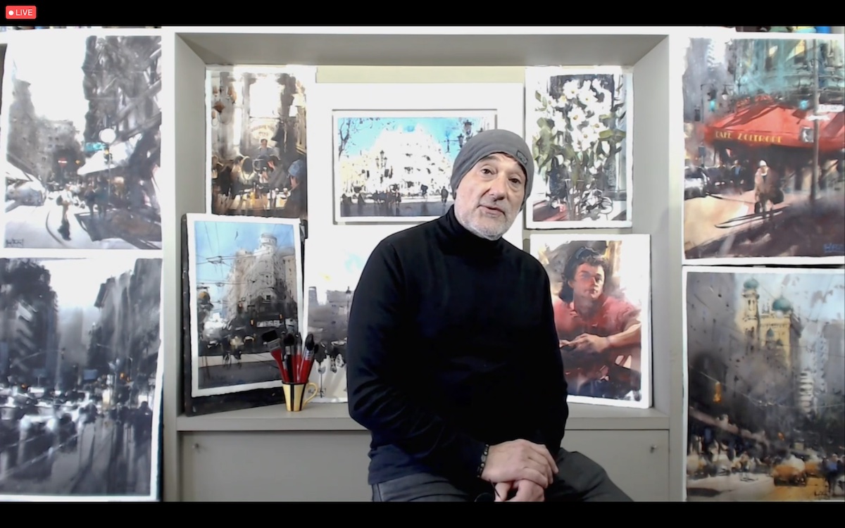
It’s no surprise that Alvaro Castagnet is one of the most respected artists in the world. For the demonstration session, he created an evocative view of the city of Prague. The mastery with which he creates the drawing is matched by the speed of execution, in which he modifies the elements of the composition at will. After drawing the large shapes Castagner captures some architectural details. In the color phase, working on a slightly inclined plane, he proceeds with the realization of large shapes that emphasize the atmospheric variation of the landscape. When the color is dry, he proceeds with vigorous brushstrokes in the realization of the buildings, enlivening the surface of the paper with spray water. The fundamental element in Castagnet’s composition is the narrative, which is rendered thanks to a skilful combination of shadows and lights in which it is even possible to perceive the conversations of the characters hinted at in the background. For Castagner, the skills an artist possesses in managing tonal and chromatic values and making edges are crucial. “I’m always surprised by the way Alvaro Castagnet goes from depicting very dark impressionistic marks and then punching in the details. It’s like watching a photo being developed,” says one participant.
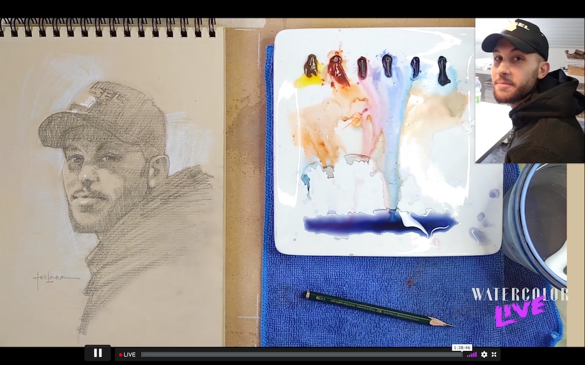
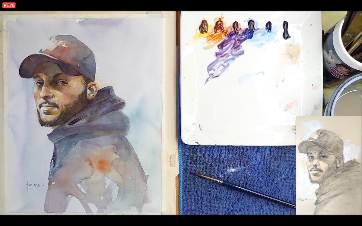
For Francesco Fontana, who made a portrait for the occasion, painting is not separate from knowing how to draw. ”Drawing skill are very much raccomandate in art as much as the double or triple check to verify the accuracy of the proportions,” says the artist, who recommends approaching the drawing in sculptural terms, in a continuous putting and taking away. In the portrait demo, Fontana began by translating the photographic image into a drawing, so as to study the scale of values, and then proceeded with the watercolor realization. In the drafting of the color, the artist performed light washes of blue because he maintains that nothing, in reality, is perceived as white. Referring also to Sargent, the artist has expressed his opinion, favorable, regarding the use of “Chinese White” to further emphasize the lights of the composition at the end of the work.
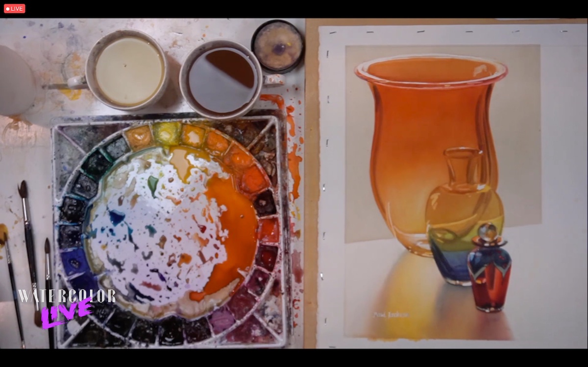
“Water balance is critical to achieving glass transparency,” declares multifaceted artist Paul Jackson, who created a still life demonstration. Jackson, extremely quickly created a glass composition, a very difficult subject to represent.
The glass, in fact, with its reflections and distortions can easily mislead the less experienced who, thanks to the recordings, will have the possibility to follow his instructions step by step at the end of the convention. The artist is a particularly curious character, and you can understand this not only by observing his brushes -which have bristles on both ends of the handle- but also by considering the fact that he begins the realization of the work by putting his signature on the paper. His signature is covered with a fluid mask made by himself and composed of latex, water and ammonia. The key to learning Jackson’s technique lies in understanding how to perfectly balance the water on the brush and paper in a predictable way. The only system that the artist recommends to follow – besides his indications – is to practice as much as possible in order to know exactly the behavior of own’s tools: brushes and paper, and adapt them to the needs.
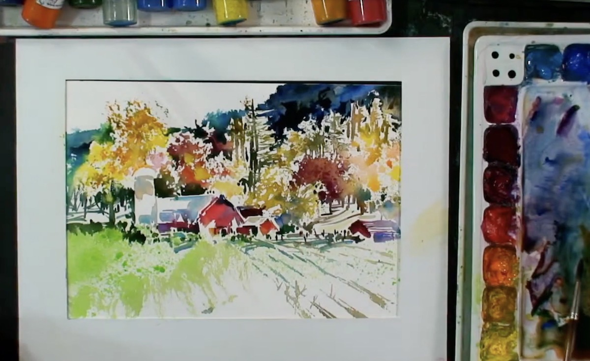
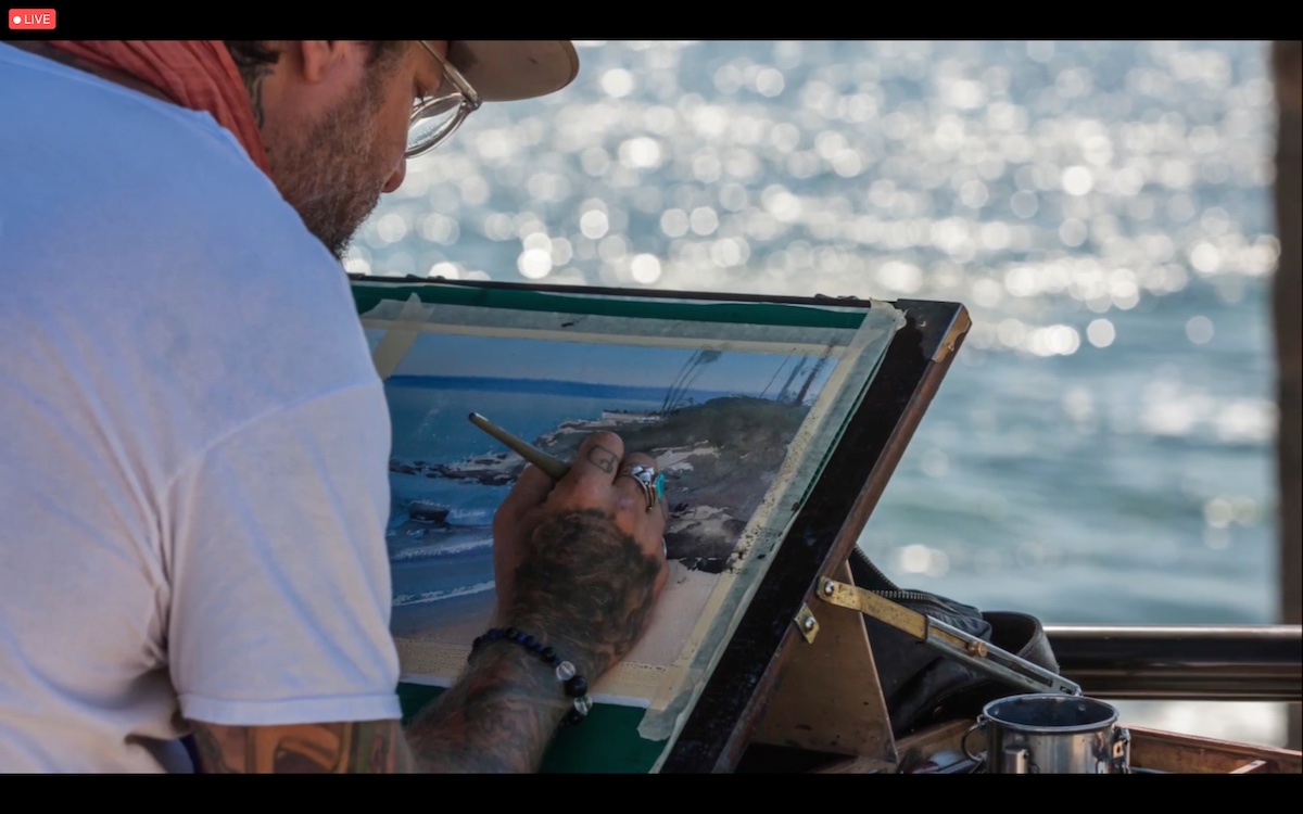
“Trust your intuition, don’t think, react,” says artist Tom Lynch who created a landscape work with a strong visual impact. Although Lynch’s intention was to offer a simple lesson in how to approach painting in an instinctive and spontaneous manner, the finished work was a harmony of vibrant colors. “I am amazed seeing how so many colors are making a beautiful Plein Air painting. I Love it,” says one participant.
The artist explained that he approached this method during plein air sessions and later put it into practice in the studio as well. Lynch, who likes to work on Fabriano Artistico’s extra white paper, continuously cleans and refreshes his brush and defines this practice as “his magic move.” He didn’t limit himself to just one demonstration but did several, each time pointing out a different topic, such as: the importance of leaving white space in watercolor and the importance of using the brush across the board, working in all thicknesses to capture the essence of nature. He also presented the audience with a safe system to succeed in both composition structure and black and white paintings.
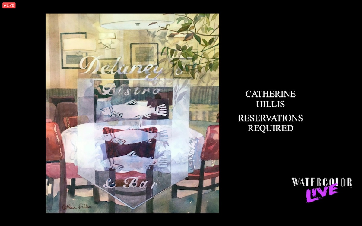
Technical notions are fundamental to approach a medium, but the study of its history is no less important because it helps the artist to understand its dynamics and evolution. In this regard, the authoritative Jean Stern, executive director of the Irvine Museum Collection at the University of California, has made an excursus on the history of watercolor painting. Starting with an analysis of the fundamental components of watercolor – color and paper – Stern traced the evolution of the technique over time. The first forms of painting date back to the rocks of Altamira in Spain, while the ancient Egyptians studied the first support made with papyrus leaves. Stern has reviewed the currents of thought, especially the English and American, dwelling on the paintings of the Californian Impressionist period, of which he is a voracious scholar and collector.
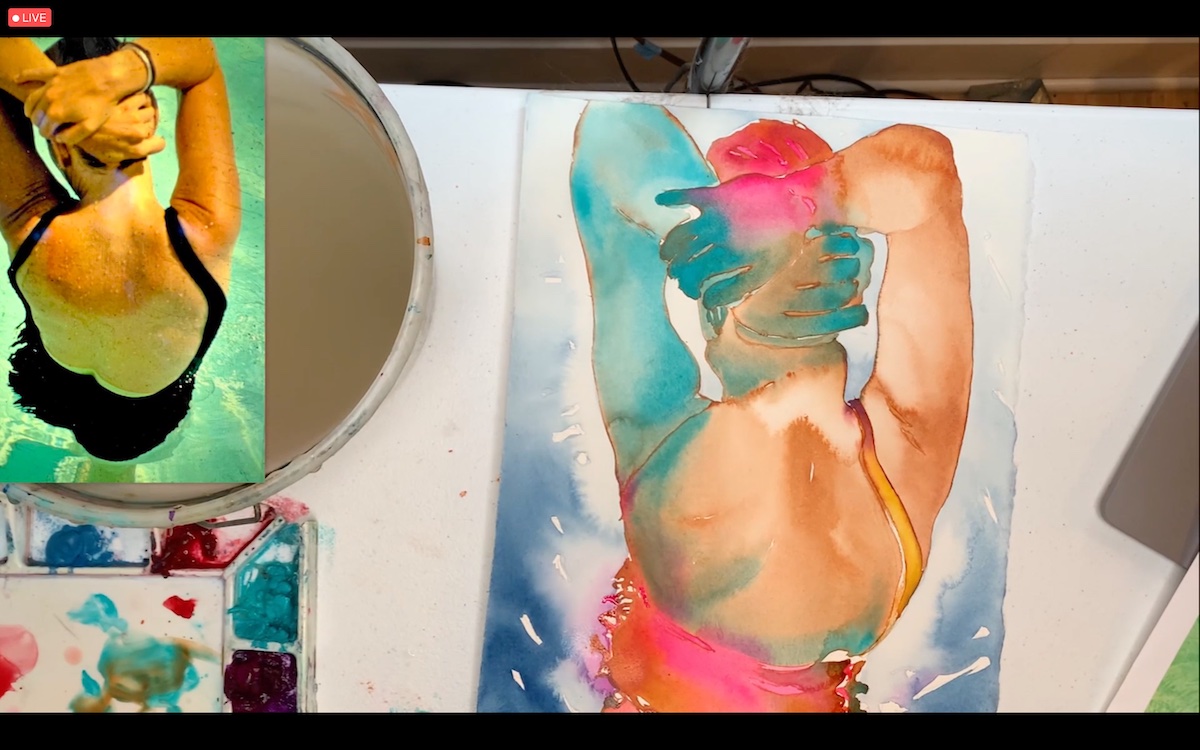
The perspective with which artist Carol Carter approaches color is completely different from those seen so far. The beauty of Watercolor Live is in fact that of seeing in a limited space of time, the artistic facets that differentiate the artists and the poetic license with which they express their vision.
That of Carol Carter, a watercolorist best known for depicting figures in water, was a bold demonstration that she started with the background -to which she added water to intentionally achieve blooms- and she ended with the figure. The artist generally avoids fixing the paper, preferring to let it dry naturally, and sometimes, to overcome the problem of arching she places weights at the ends.
The complementary, saturated colors used by Carter played a key role in the composition that she called, “hot tropical presence.” In applying the color -wet on wet- the artist proceeds by zones as if following the anatomical map of the subject, which in this case, focuses on the neck and along the spine. To harmonize the colors with each other, she finally uses bridge colors with which she joins the different sections. “I love how your style is so unique and it always reminds me of what a negative looks like in a movie, it’s just magical!” said one participant.
As with other Streamline events each morning, Sarah Webb -Sales Manager for Vendors, Suppliers, and Conventions at Streamline Publishing- greets guests in the Breakout Room as they await the official start of the convention.
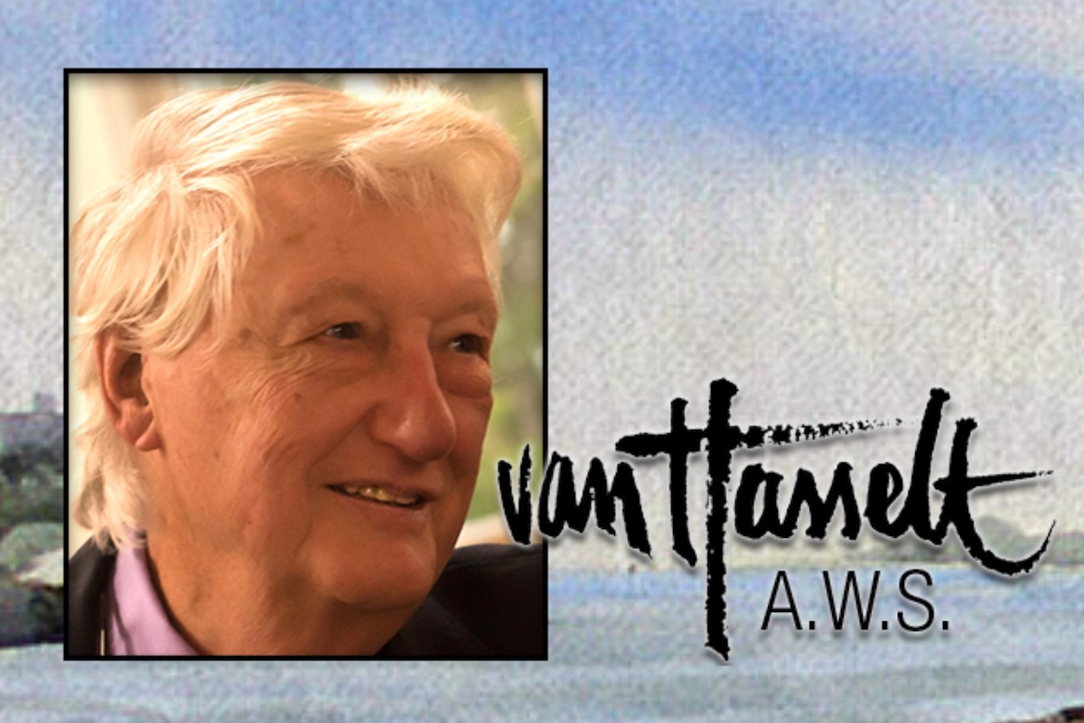
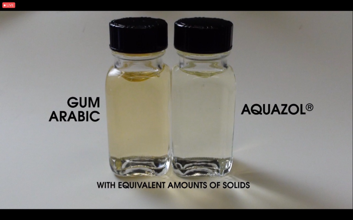
In the Breakout Room, the event’s sponsors rotate through demonstrations in which they highlight what’s new in the marketplace and offer practical tips. This is the case of Joe Miller of Cheap Joe Art Stuff who, before starting the demo, wanted to remember his friend Tony van Hasselt, a renowned landscape artist who recently passed away.
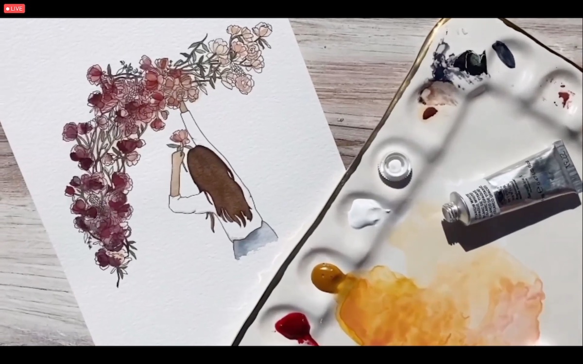
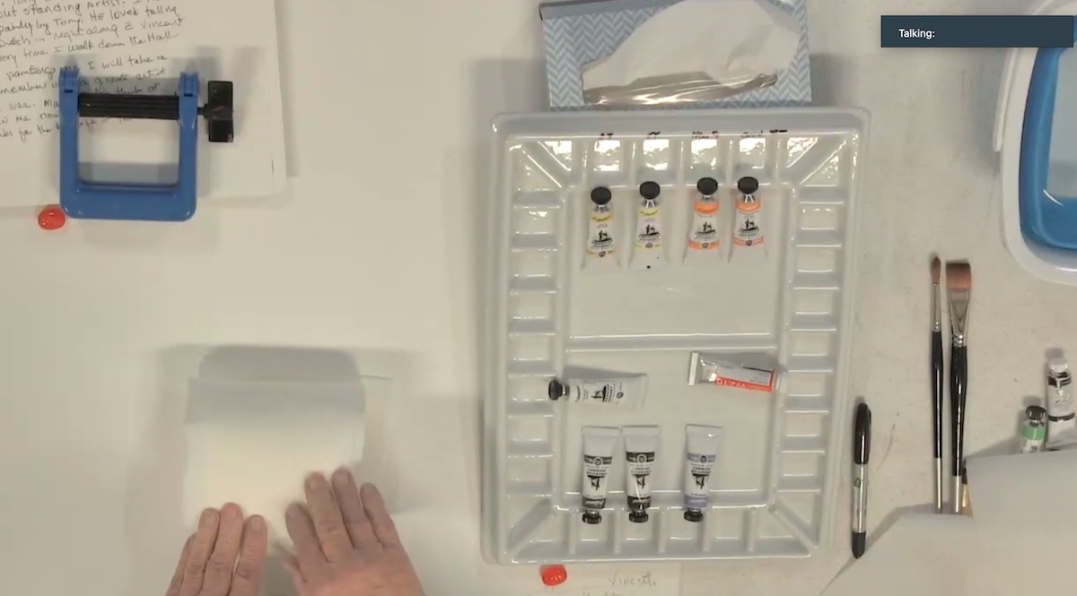
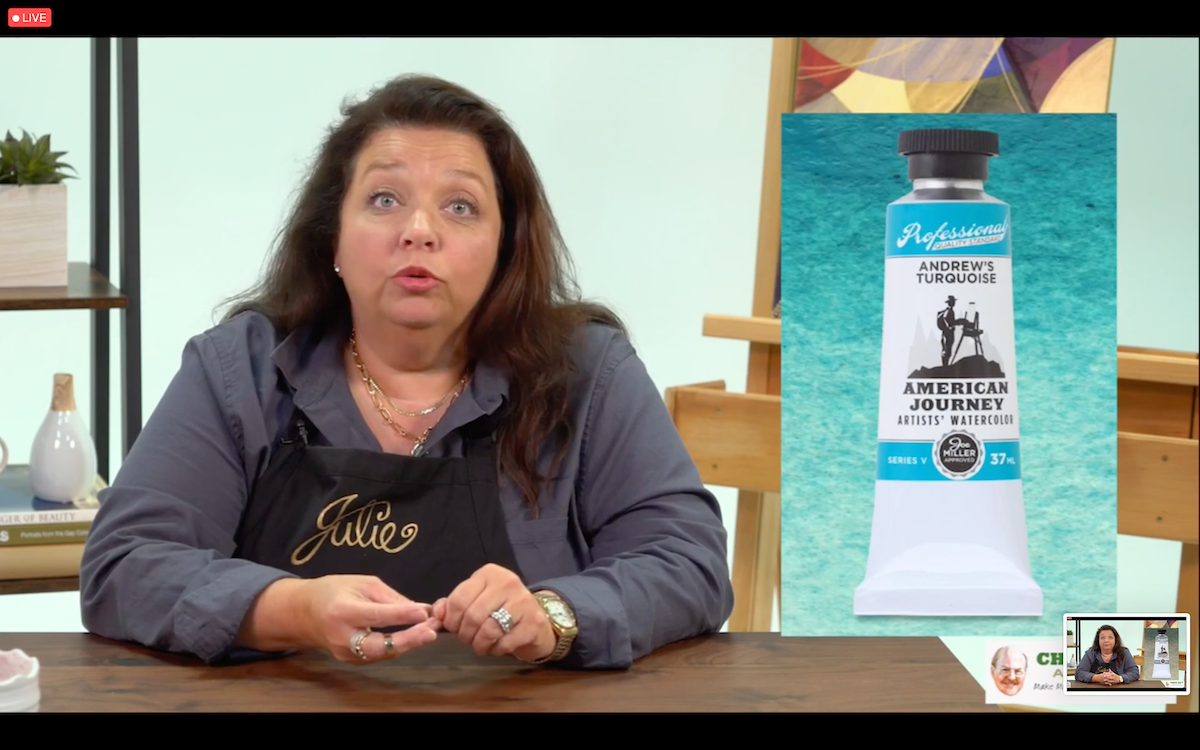
Well-known face in the art world Joe Miller represents a landmark in the industry because of his gentle ways and the life stories he tells. In the demo, Miller, mixed his favorite colors in the gorgeous porcelain palette, the Cavalcade Porcelain Palette. Very easy to clean and very roomy. The palette is available on her site at the link: https://www.cheapjoes.com/catalog/product/view/id/19847/s/american-journey-cavalcade-porcelain-palette/. In addition to the products for sale Miller showed how to make a handy blotter to replace the canonical blotting paper. Joe Miller is a believer that learning to use color is all about using it. To encourage this approach and to avoid the sense of dread caused by wasting color, which is often prohibitively expensive, he developed the American Journey Artist’s Watercolor series. A quality version with all the product certifications but at the same time economical. The range is composed of 15 colors, three of which are exclusive: Andrew Tourquoise, Getz Gray and Sap Green.
“Don’t give up, you can do that.” is Tish de la Bretonne’s closing phrase with which the first day of Watercolor Live closes. Focus on the techniques and advice given and find your level of confidence, Watercolor Live awaits you for a new and exciting day.
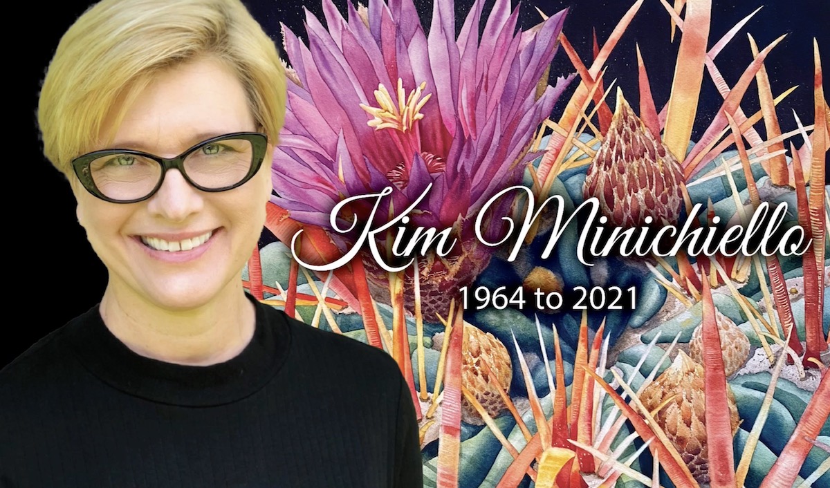
During the day, the prayers and thoughts of the audience and organizers went out to the family of Kim Minichiello, a great artist and President of the Florida Watercolor Society, who passed away prematurely.
(on the title: Alvaro Castagnet’s landscape demonstration)
