This post is also available in:

With the Lowe After Hours, a sponsored Bacardi event, the POP ART Print exhibition was officially opened on Thursday October 5th, at the Lowe Museum in Coral Gables, open until December 17th. As already anticipated, the exhibition consists of 37 pieces mainly from the50s and 60s, from the Smithsonian American Art Museum in Washington with a group of artists that constitute the official formation of the Pop Art movement: Robert Rauschenberg, Jasper Johns, Jim Dine, Allan D’Archangel, Roy Lichtenstein, Robert Indiana, Claes Oldenburg, Andy Warhol, Mel Ramos, James Rosenquist and Tom Wesselmann.
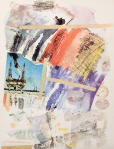
Untitled,1972, R. Rauschenberg.
Robert Rauschenberg and Jasper Johns may be considered the forerunners of American Pop Art, and they, too, like other Pop Art artists have had a background in the advertising environment. To Rauschenberg in particular, we owe the invention of “combine painting” with the use of non-traditional materials and objects such as photographs and newspaper clippings, combined with the use of color and transferred onto canvas through the silkscreen process. Silkscreen or screen printing allowed Rauschenberg to tackle multiple reproducibility of images, allowing other artists to challenge the idea of traditional art.
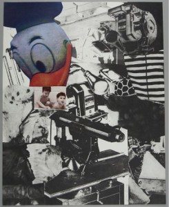
Untitled, from Portfolio AToolBox,1935 Dine
Jim Dine, using bright colors, the clear and linear style of Pop Art, used Rauschenberg’s technique questioning the power of particular iconic symbols dear to him: the heart, and the Tool Box, ubiquitous in American garages . He isolated them, framed and raised them to be the ideal instruments for the representation in the new pop lexicon of everyday objects. The tools shown in the Tool Box series were cut from industrial design magazines and engineering manuals and then printed on different surfaces, modeled on the Rauschenberg combinations.
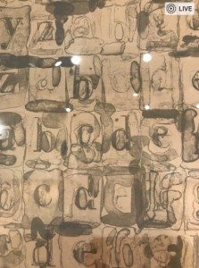
GrayAlphabets,1968part. J. Johns
Jasper Johns takes possession of the popular iconography using instead maps, flags, letters and numbers, the “flat signs”, of immediate decipherment: objects and symbols typical of mass society, which allow through a series of family associations to respond to perceptual research aimed at the revaluation of a visual cliché now devoid of content due to excessive familiarity and transformed into an abstract and figurative painting, which eliminates any hierarchical division between artistic and non-artistic material.
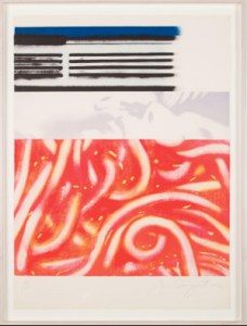
Forehead I, 1968- Rosenquist
James Rosenquist was among the first to tackle the persuasive, even deceptive, power of advertising by applying the surrealist practice of overprinting apparently unrelated subjects to commercial images and advertisements to highlight the omnipresence of ads. His, is a polychrome painting that exasperates details of trivial objects, de-contextualized, and thematic ideas that are part of daily life, combining them in such a way as to merge them together and connect them.
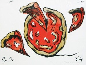
Flying pizza 1964, Oldenburg
Claes Oldenburg in his early years of production preceding the imposing figures that will characterize him later, bases his art on consumerism linked to food, focusing on drawings easily understood by anyone, characterized by very bright colors, sometimes “colanti” that represent what the undernourished American population consumed in the 1960s. The food of Oldenburg, as an object of consumption, is charged with a horrid meaning, because it is devalued by its primary role and reduced to a mere commercial product.
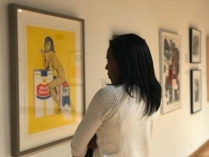
Tobacco Rose,1965 Mel Ramos
Mel Ramos is best known for his paintings of “voluptuous female nudes” alongside branded logos. The combination of women with consumer products like cigarettes rather than snacks or drinks serves as a starting point for reflection on the way capitalism has used the female body in a theme that I would say is far from over.
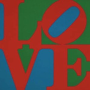
Love, 1967. R. Indiana
The work of Robert Indiana consists instead in the use of very simple but brave iconic images. His best known example is LOVE, the word par excellence of the hippie movement. Love in capital letters, arranged in a square with an inclined letter “O”. The red-green-blue image on display was created for a Christmas card for the Museum of Modern Art in 1964.
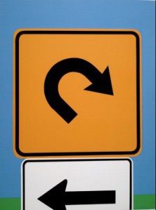
Landscape III,1965. A. D’Arcangelo
Allan D’Arcangelo stands out for his paintings of motorways and road signs: icons, monumental archetypes of the American highway that seem to evoke a precautionary perspective on the future of the American country.
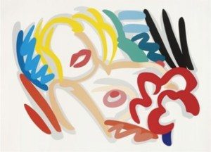
Big Blonde1989, T. Wesselman
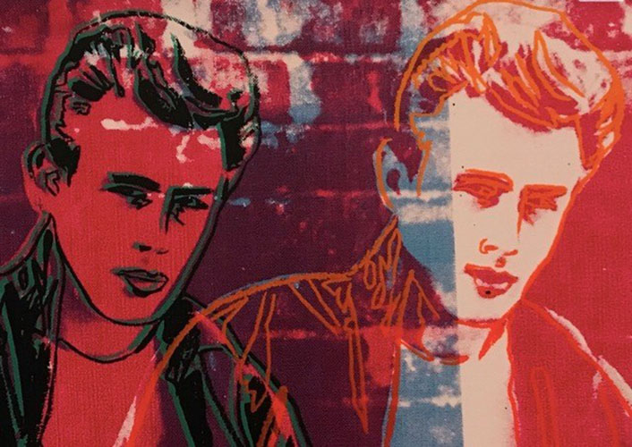
Tom Wesselmann is considered one of the greatest artists of the New York Pop Art, along with Roy Lichtenstein and Andy Warhol. The most famous of his series is “Great American Nude” of 1960, characterized by flat figures in a palette of intense colors: red, white, blue and yellow, mainly. In the series he literally re-elaborates the female nude giving it a third dimension thanks to the use of the plexiglass modeled on the female figure and then painted. Much has been said and always will be said of Andy Warhol: obsessed with celebrities, and consumer culture, he created some of the iconic images of the twentieth century, and still influences the art of the twenty-first . Repetition was the key to his success for which art carried the shelves of a supermarket inside a museum or a painting. As well as his portraits: Marilyn Monroe rather than Mao Tse Tung, using the printing medium on silk to obtain its characteristic thick edges alternating with flat areas of color. He used the same technique for his portfolio of advertisements, which includes the exhibited work “Rebel Without a Cause 355”, which in the Italian ear sounds more like “Gioventú Bruciata” with James Dean.
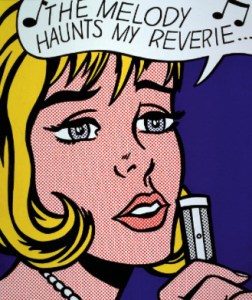
Reverie,1965. R. Lichtenstein
Roy Lichtenstein identified his expression of pop art through comics, defining pop art not as a form of American painting but as an industrial painting, with his big faces in the foreground that fill most of the visual field just like on TV screens; the clouds of dialogue and thoughts above the heads of the characters. Essential for what Lichtenstein was doing was the use of the characteristic Ben Day stitches, a printing process in which tiny dots in different colors were used to create half tones on the economic paper of magazines thus forcing the eye to slow down, so that the observer was obliged to find a way through the image that, otherwise, would have only been attempted to peek quickly.
