This post is also available in:

“We don’t believe talent is the point and we offer you, every year, the possibility to join from some of the best artist ever to improve your skills,” said Eric Rhoads in his keynote address at the beginner/refresher ‘s day preceding the third edition of Watercolor Live.
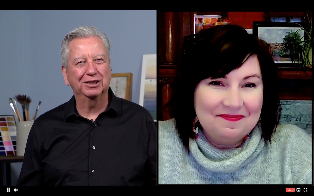
The event, entirely dedicated to watercolor and attended by 31 countries, was presented in collaboration with Kally Kane, PleinAir Magazine and American Watercolor Weekly Editor-in-Chief and well-known face of the large Streamline Publishing family.
The beginner/refresher day is always a great opportunity to refine thoughts and ways of approaching this exciting medium of painting.
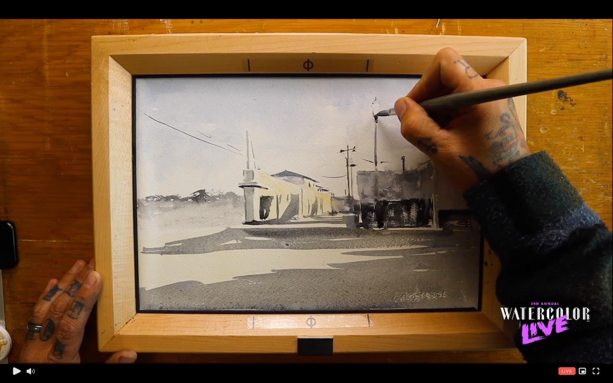
It was Gabriel Stockton, jury member of the Salmagundi Club of New York and the San Diego Watercolor Society, who opened the daily demonstration sessions. Beginning with the concept of gravity and evaporation, which inevitably tie into the watercolor technique, Stockton presented the materials needed to execute the technique. In addition to presenting the multiplicity of brushes on the market, the various types of paper -cold/hot press, traditional white or extra white, smooth/ruff and different grammage and the grain size of the colors- he dwelt on the importance of the easel. A fundamental support especially for those who, like him, practice watercolor painting in plain air and consequently need two specific characteristics: lightness and inclination. In this regard, he presented a very practical product, the Eric’s Plein Air Watercolor Frames: the easel designed in collaboration with Joe Miller of Cheaper Joe that allows the different components of the easel to be modulated according to the artist’s needs.
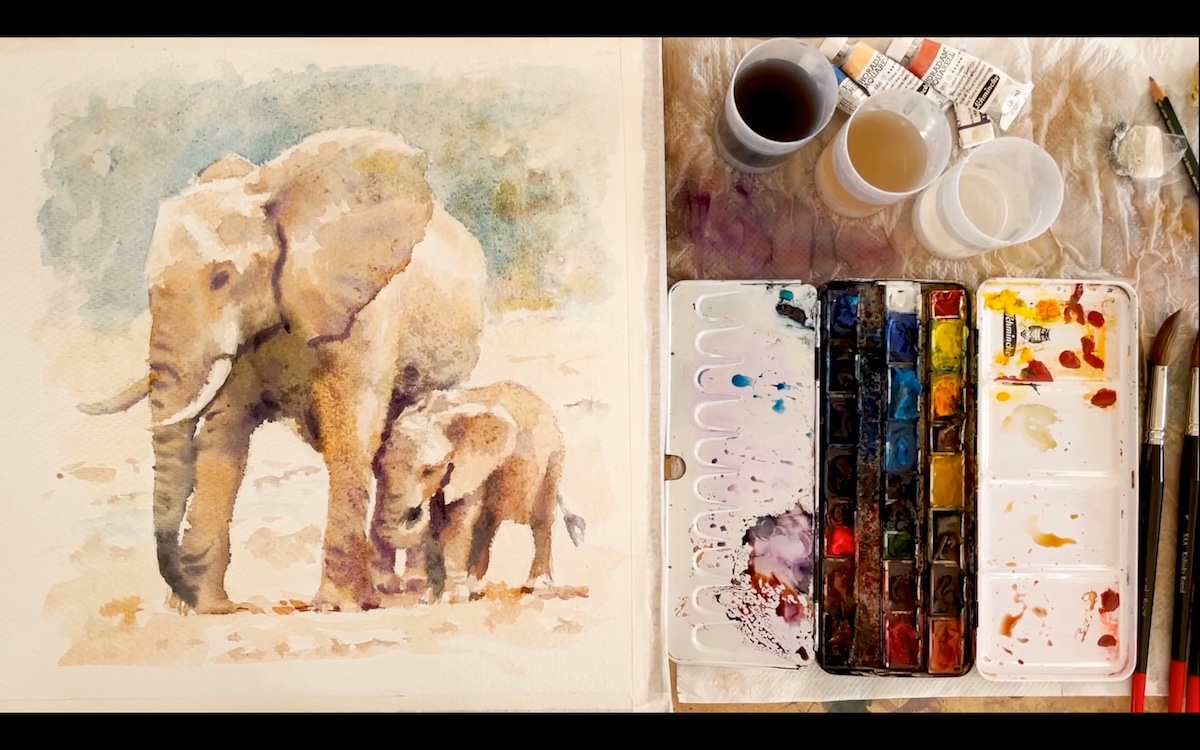
British artist Hazel Soan, who divides her time between England and South Africa, showed the importance of contrasting light and shade in the execution of solid, believable watercolor work that is able to render the three-dimensionality of the subject depicted. To facilitate the understanding of the concepts explained, she painted a pair of elephants, whose mass and volume lend themselves well to the disquisition of light and shadow contrasts. Taking care to keep as the brightest point the white of the paper Soan began in the drafting of the masses with large shapes, made with a flat brush, which she replaced with a thinner brush in the definition of the smaller ares. The artist, who likes to work wet-on-wet, emphasized the great ability of water to mix pigments directly on the paper and showed how, from the addition or non-addition of water, the tonal values derive: lighter or darker depending on the amount of water added.
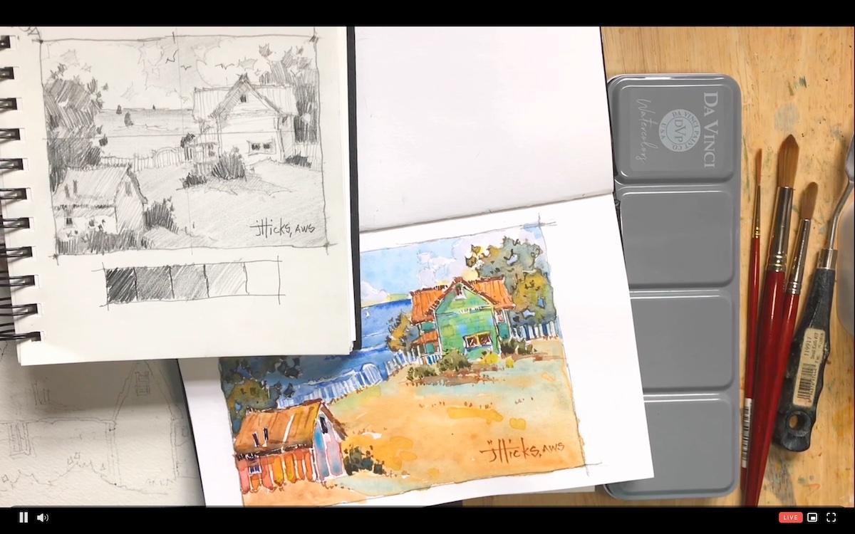
The painting of artist Joyce Hicks represents the apotheosis of the traditional watercolor concept, with its poetic and intense colors. Beginning with a black-and-white composition, she has created a vibrant color composition based on the fact that it is not the colors that are the fundamental element of the painting, but rather the color temperature and tonal values, which she realizes previously on preparatory sketches. The variation of color temperature, which implies, like the pieces of a puzzle, the adjustment of other compositional values, allowed her to keep vibrant and fresh the landscape composition she made from wet-on-wet technique, to finish with deliberately unrefined final touches. These brush touches that the artist moves like a pencil are meant to “suggest” the compositional elements without defining them in detail, because, as the artist stated:” let the watercolor make the small differences on its own , thats the beauty of the medium.”
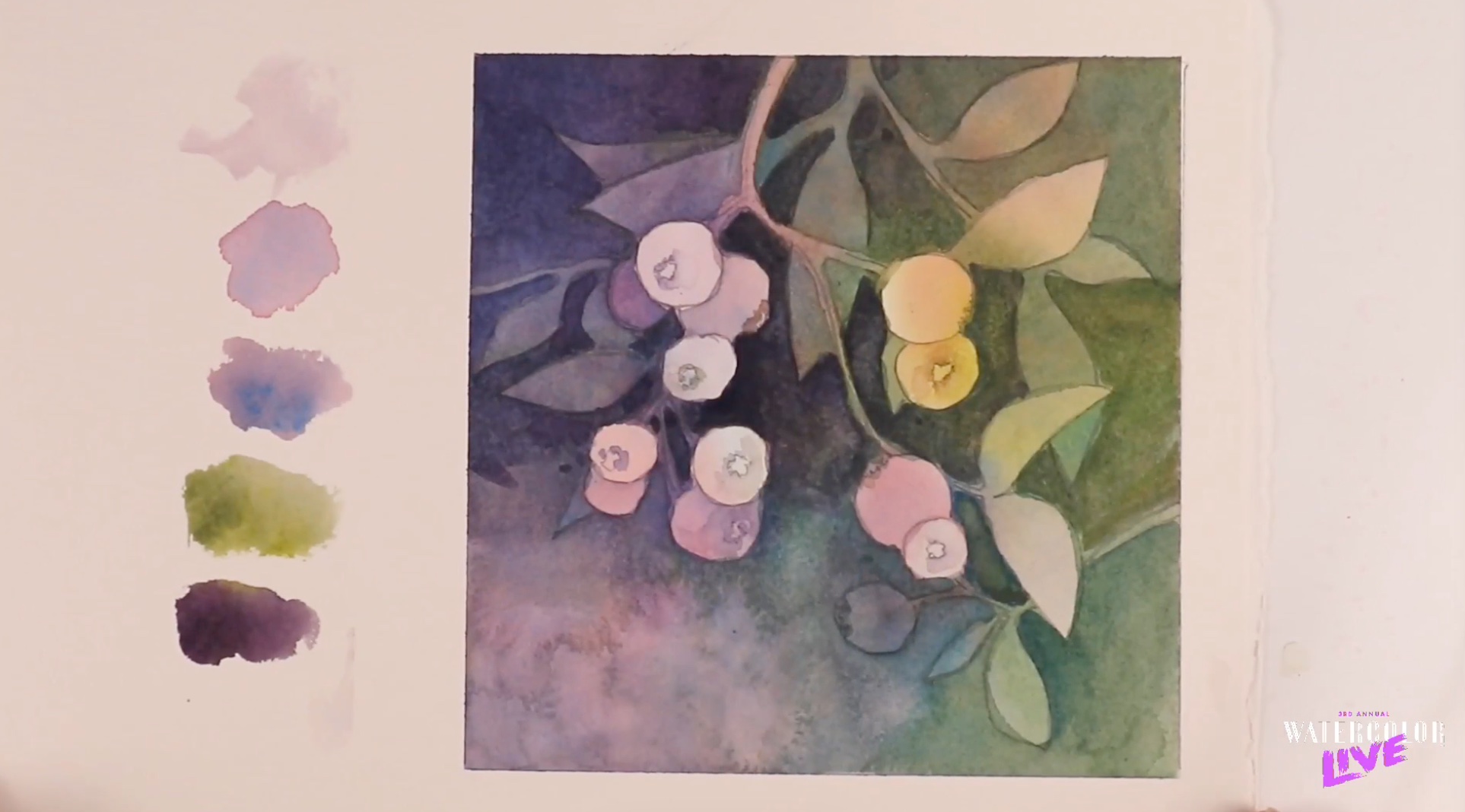
In watercolor as in any other painting technique there are different methods of approach, and the one presented by Canadian artist Linda Kemp attracted considerable interest from the audience.
Kemp showed how it is possible, if not easier once the technique is learned, to create a composition from negative spaces. Spaces that are considered as forms in their own right and later acquire their own identity by integrating into the whole.
For the realization of the composition, she started from a colored underpainting on which she later derived the pivotal compositional elements -the blueberries- derived from the definition of the surrounding spaces in a multi-layered overlay that proceeds from front to back and where it is the shapes and edges that cadence the compositional narrative.The result is a simple and linear composition that focuses on the relationship between form, space and color.
What Kemp explains is a method that may initially seem confusing and about which the artist said, “it will get worse before it gets better. Don’t quit now…just keep going.” , but which, when the process is somatized, guarantees satisfactory results. The technique, which simplifies compositional processes, is applicable to any subject without the fear of overworking because, as Kemp states,” Don’t worry about overworking your painting because all it’s fixable.”
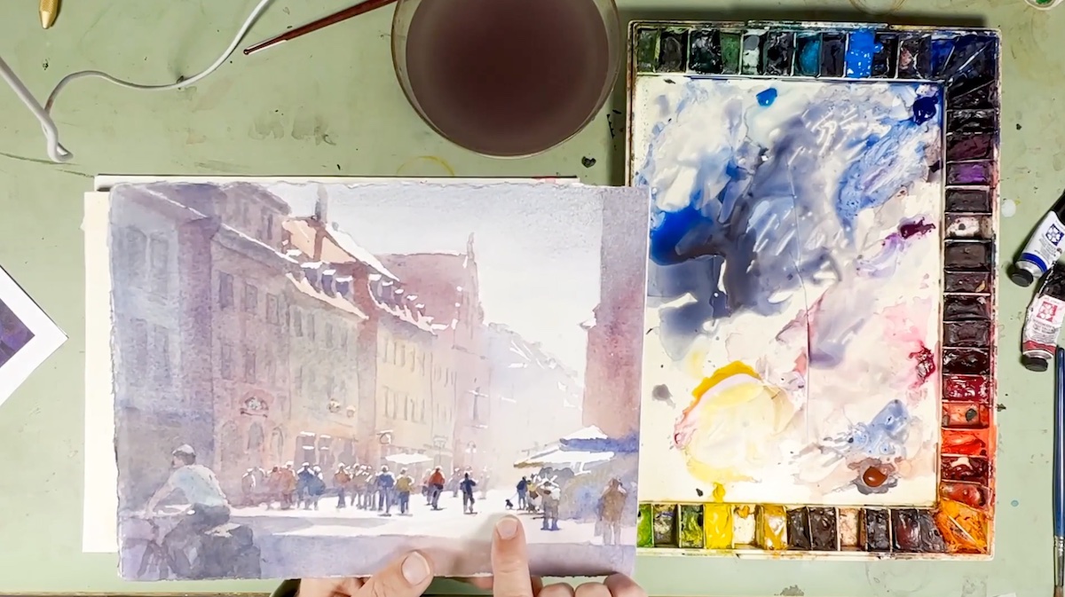
Composition is a pivotal element in the artistic process because in addition to representing the artist’s visual vocabulary, it conveys the viewer’s eye. A definition that architect and illustrator Peter Jablokow complemented by defining the principles of composition as the tool through which to eliminate ancillary elements that are not useful for narrative purposes and which the artist calls: “disturbing noises.” Illustrating the approaches he habitually uses, he dwelt particularly on the importance of principles (balance, gradation repetition, contrast, harmony, dominance and unity) and design elements (line, shape, direction, size, texture, color value).
For the creation of complex architectural compositions moreover, Jablokow, with the help of Photoshop, turned the color image into a black-and-white image with which he analyzed the masses and volumes on which he later worked, reducing or emphasizing the elements, previously represented on multiple preparatory sketches, which he subjected to external feedback to check their compositional solidity. Once the compositional bullet points are established he also establishes the relationship between the parts.
All of the principles and elements are easy to learn in principle, but the way Jablokow poetically expressed his thought process delighted the participants.
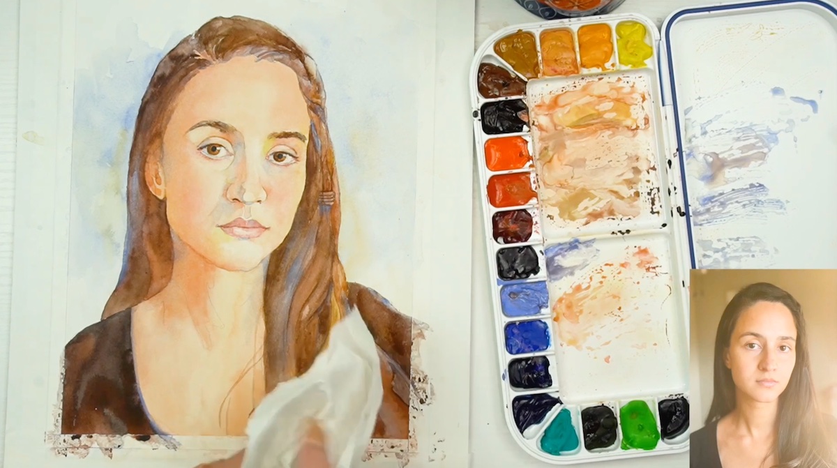
“Watercolor can mingle like no other medium. It is magical,” said quotation-loving artist Cindy Briggs, who in the color-focused demonstration session sculpturally created a portrait of a model while sharing with participants her invaluable chart for creating skin tones.
Through a guided process, and explicated step by step, the artist highlighted the importance of keeping the basic palette composed of the colors used in the initial underpainting (with which she emphasized light and dark masses ) and then blending them for the realization of individual parts of the face such as the eyes, mouth or nose, in a succession of hard and soft lines, soft and hard edges and tonal variations. According to Briggs, it is useful in watercolor painting to define the different consistencies of color used in the making of the face, consistencies that range from “milk consistency” (thicker because it is water-poor and pigment-rich) to the transparency of herbal infusion (water-rich and pigment-poor) and that serve in the definition of the different planes of the face, which she makes individually and then harmonizes them as a whole. In fact, portraiture more than any other artistic genre needs to define the relationship and harmony between the parts by referring to certain parameters that can be sought through triangulation or symmetry, but in any case must take into account, first and foremost, the respect of tonal values. Briggs loves to paint the eyes, which she considers the focal point of a portrait and on which she also spends entire demonstration sessions.
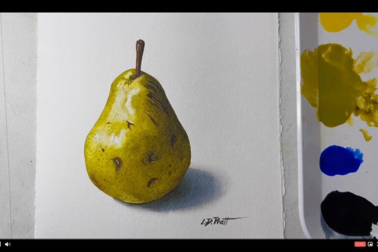
Artist Lynn D.Pratt, with a career as an architect behind her, made a demonstration of still life with a WOW effect starting with an extremely simple subject: a pear, which she made with few colors but which rendered its three-dimensionality from the first brush strokes. Starting with wet on wet, with which she defined the edges of the pear, she delved into the definition of tonal values and finally into the details, which she rendered with an abundance of detail, helping herself with a very thin brush and making sure that the previously applied color was dry. “I do LOTS of testing with colors, mixes and washes BEFORE I do EVERY painting and even if its colors I always use I take some scrap paper and check all my mixes and values.” declares Pratt, who has produced a book complete with color swatches for every single color she uses, distinguished by brand.
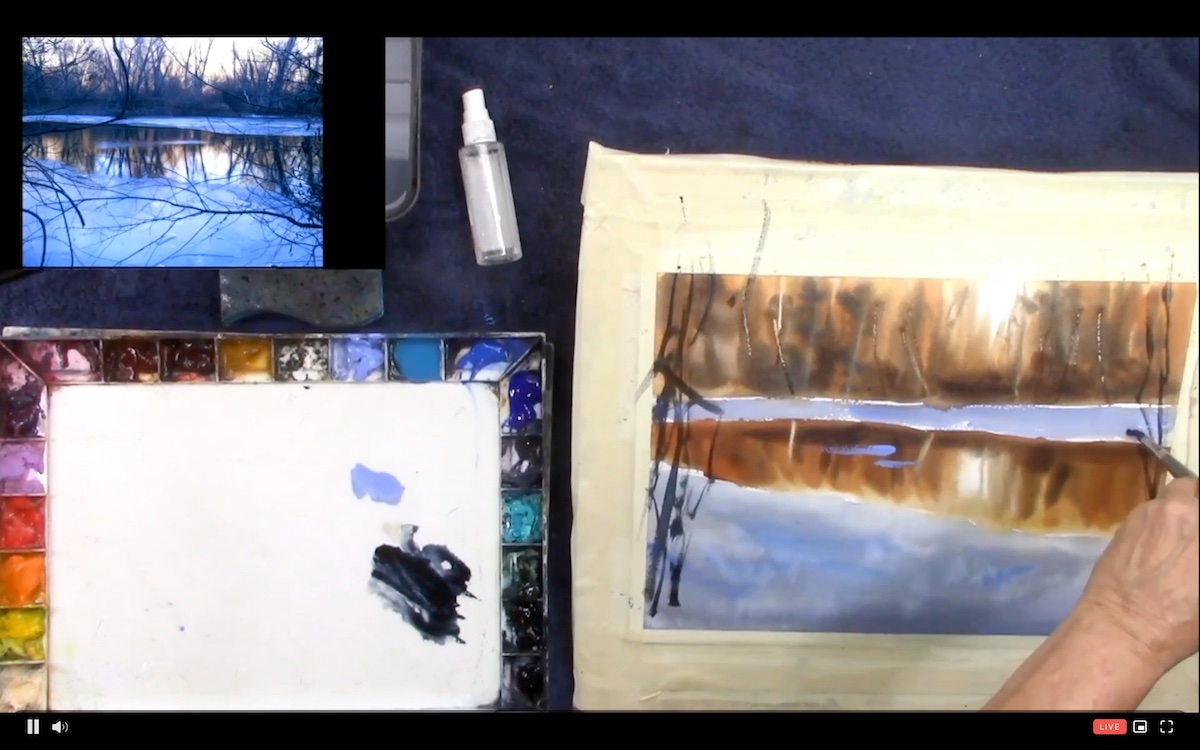
The beginner’s/refresher day concluded with a landscape demonstration by artist Sarah Yeoman, loosely inspired in her choice of subject-a glimpse of a snowy creek-by Andry Wyeth.
Before final drafting, she made a black-and-white study of the work using Payne’s Gray and emphasizing the importance of making preparatory sketches. “Practicing by making preparatory sketches in black and white helps in defining the tonal differences that make the sense of perspective and three-dimensionality of the work,” the artist said.
In arranging the colors, the artist, who helped herself to mid tones with a dry brush, focused on making one section at a time, which she later harmonized, adjusting the tonal values, until the final harmonization of the composition. For the execution of an effective painting, Yeoman reiterates, in addition to the importance of laying down “confident strokes,” the importance of thinking of individual compositional elements as simple sets of shapes and tonal values that take on texture and meaning in the final overall harmonization of the composition.
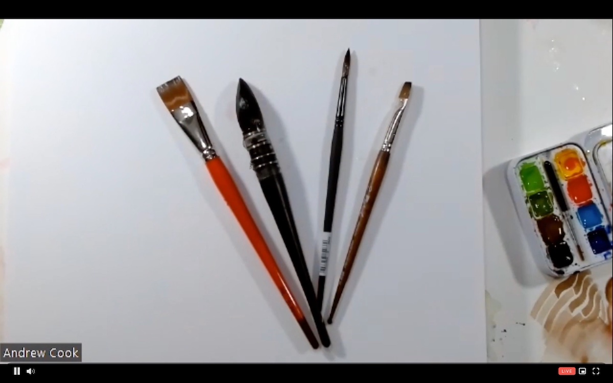
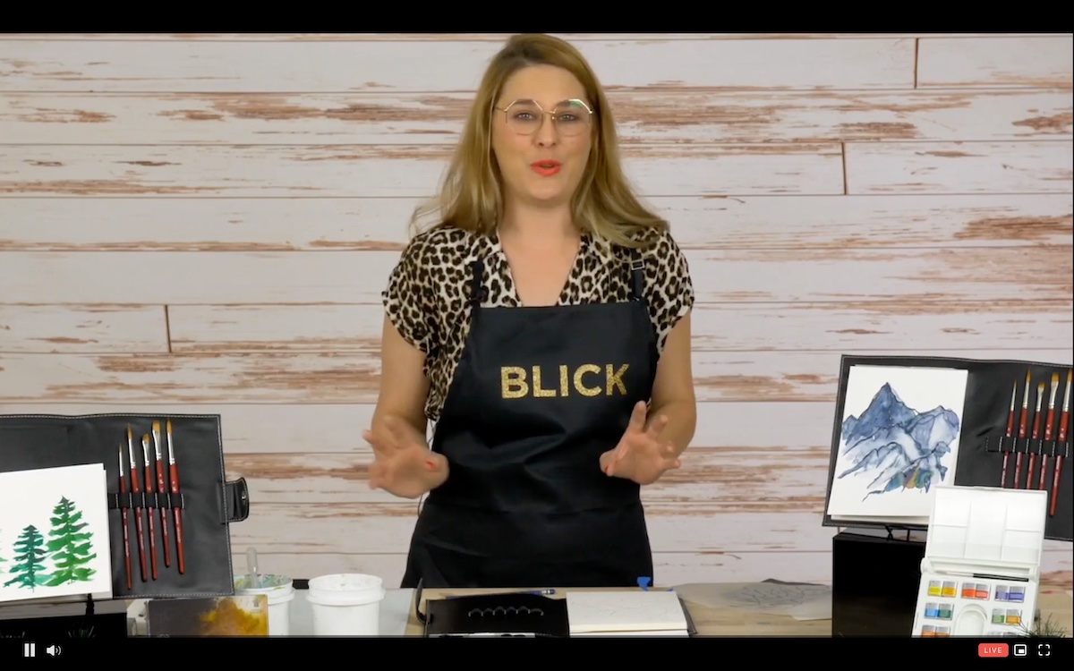
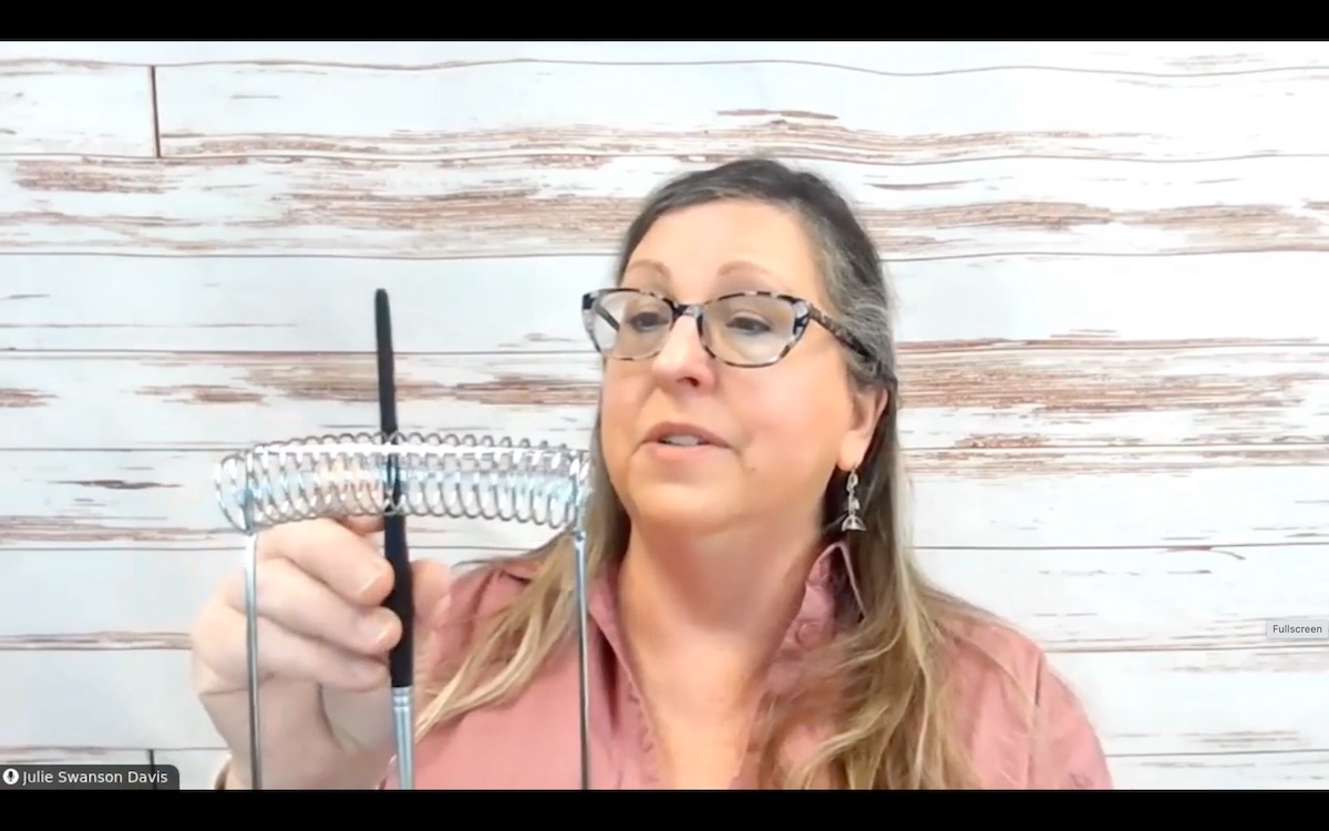
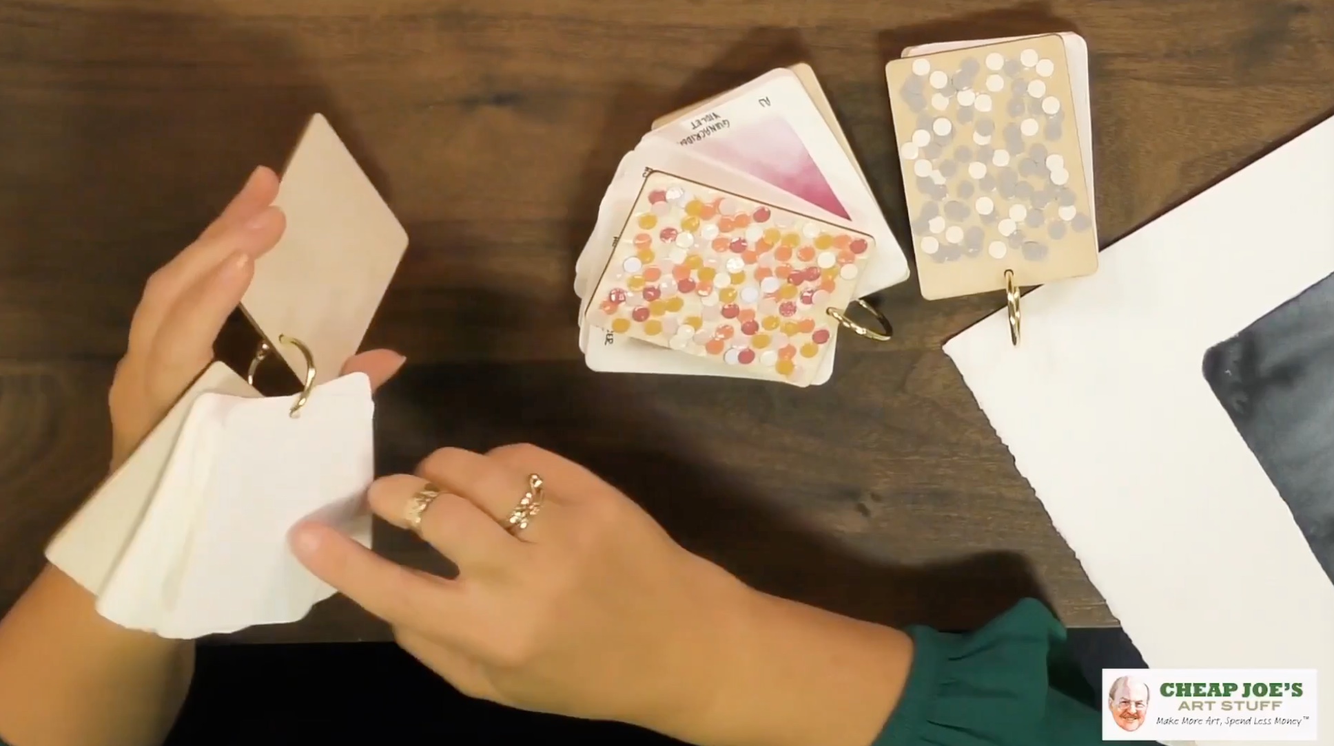
In addition to the various demonstration sessions by Watercolor Live faculty members numerous were the demonstration sessions by the event’s platinum sponsors: Blick Art Materials with demonstrations by Julie Swanson Davis and Ashley Nordin; Roval Talens in the person of Vic Von S, Julie for Cheap Joe’s and Andrew Cook for Raphael, the event’s new platinum sponsors.
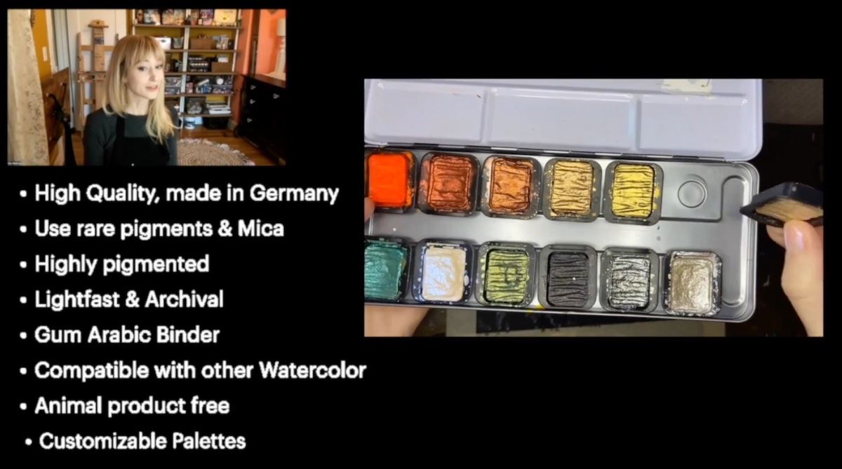
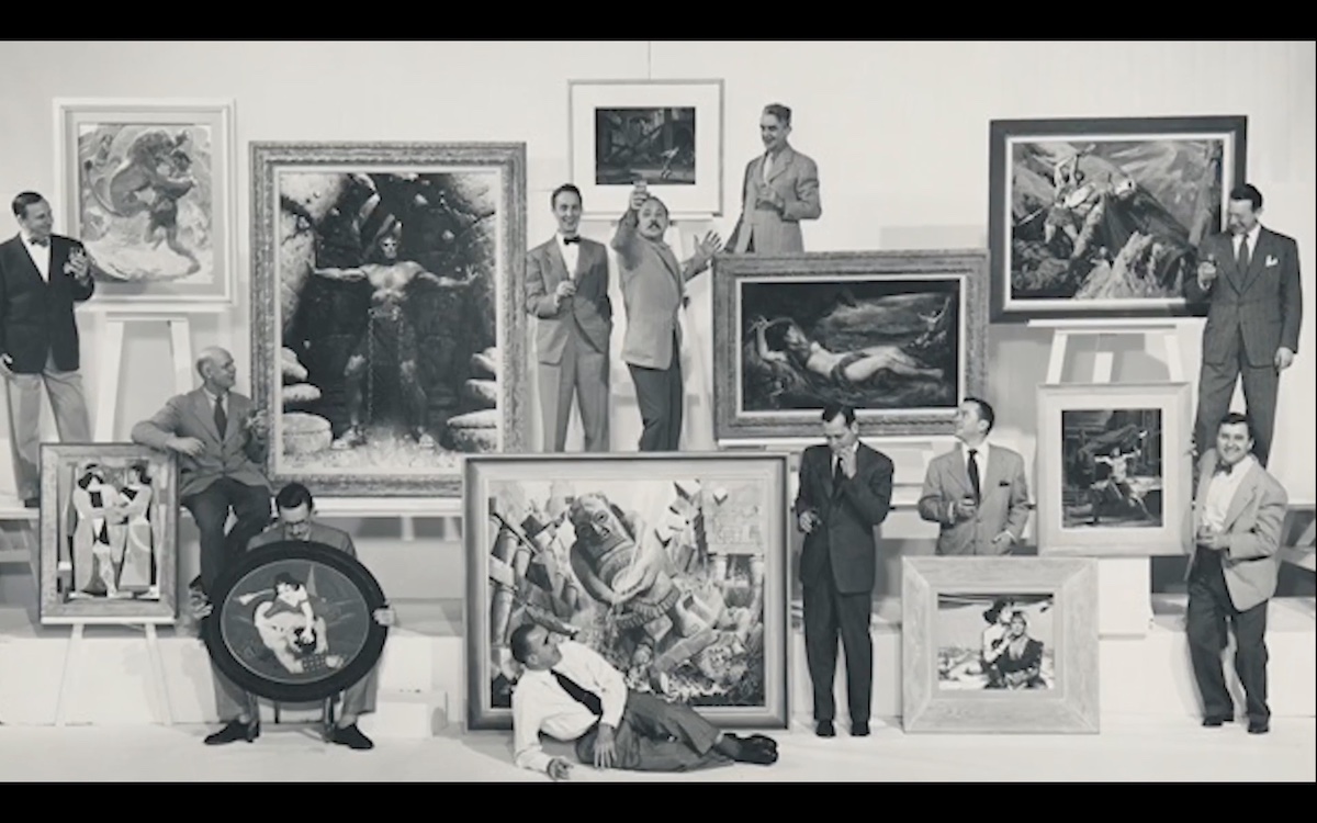
In terms of event sponsors that became part of the event there are: Kanuga Watermedia Workshops, known for its eclectic, high-level workshops; Hahnemühle FineArt, Inc. a German company that produces quality paper; and Famous Artists School have also joined the team. The latter is the 2.0 version of the famous school established in 1948 by Norman Rockwell and Albert Done in collaboration with ten other famous artists of the time, which will feature Thomas W Schaller as its first protagonist engaged in a full immersion in the world of watercolor.
Miami Niche awaits you tomorrow for the official start of Watercolor Live and its incredible faculty members: stay tuned and follow us, including on social media, you will not regret it.
